Accessibility Website. UX Design Project
We designed an accessibility website as a team for accessibility services that are available in the Dublin 8 area.
Project Overview
The Project We designed an accessibility website as a team for services available in the Dublin 8 area
My role Research accessibility, wireframe sketch the website, make the profile login / sign up pages, the search bar and announcements cards
Key Learnings Wireframing, Figma wireframing and prototyping, material design kit, team work, communication, time management, presentations
Accessibility Research
Universal Design (Design for all)
W3C’s WAI (Web Accessibility Initiative)
WCAG
W3Schools
Wireframe Sketches
The homepage. Based off the user’s needs. Search bar is big and in the centre of the page with service search and location search. ‘Somewhere to call to home’ button. Accessibility options at top.
Up to date information about services.
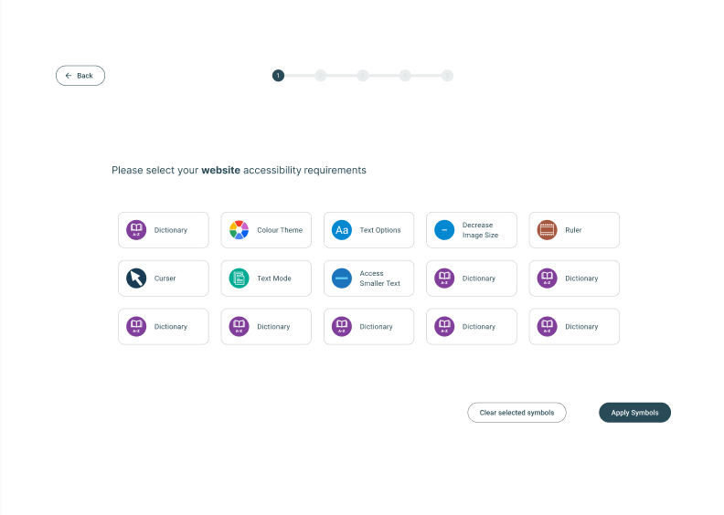
Personal Profile set up. Select their service and website accessibility needs, say a bit about themselves, suggested profiles, all info saved in one place.
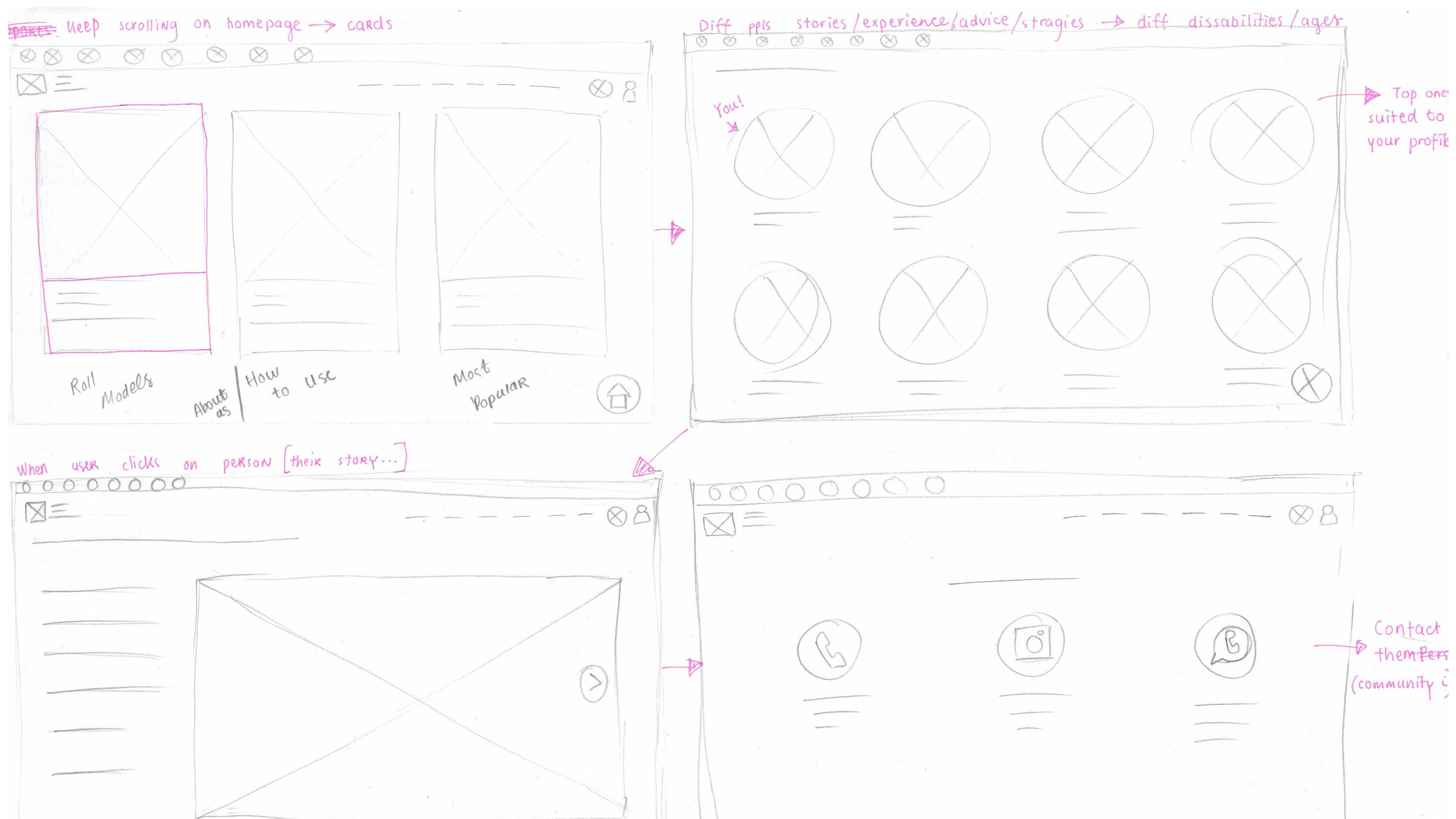
Cards on ‘Roll models, How to use and Most popular’. One of the user needs was to have a sense of community. They want to connect with people of their own age etc. Not just people with the same disability as them. There are profile suggestions for them based on their interests.
Service profile page. Map of location, accessibility symbols / written guide (pop up) on how to get there, reviews.
Help, Announcements and Contact Pages.
1st Iteration Samples
User Testing
No need for tick boxes on ‘select page’
A numbered progress bar rather than a line
About Me has too many questions and too long
Does it need a side navigation bar?
Changes Made
We decided on a colour theme and a component library as a group
Labels and icons on the buttons / links
We used the Material Design Kit more
A better layout for the final profile page. Inspired by an actual website
Used existing patterns instead of my own
Search Bar
Location popup instead of splitting the search bar in two (service search and location search)
Search bar is front and centre of homepage
Announcement Cards
Announcement Cards on the homepage for up to date info on services
Colour coded
‘Available’ date always on the cards


